Business Insider
Home
/
work
/
Consumer Subscriptions
#
Interaction design
#
Responsive Design
Business Insider
Business Insider
Home
/
work
/
Consumer Subscriptions
#
Interaction Design
#
responsive Design
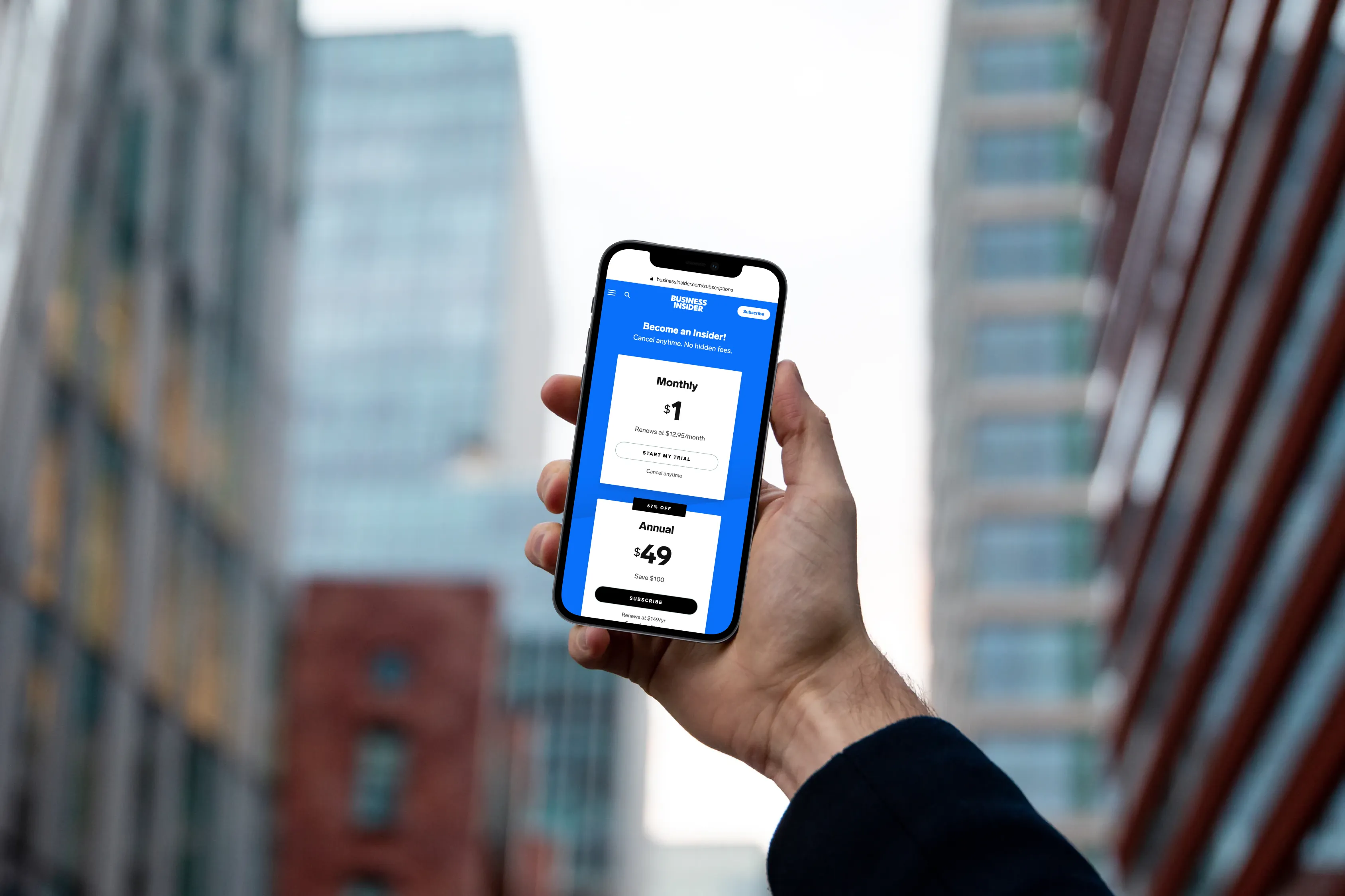
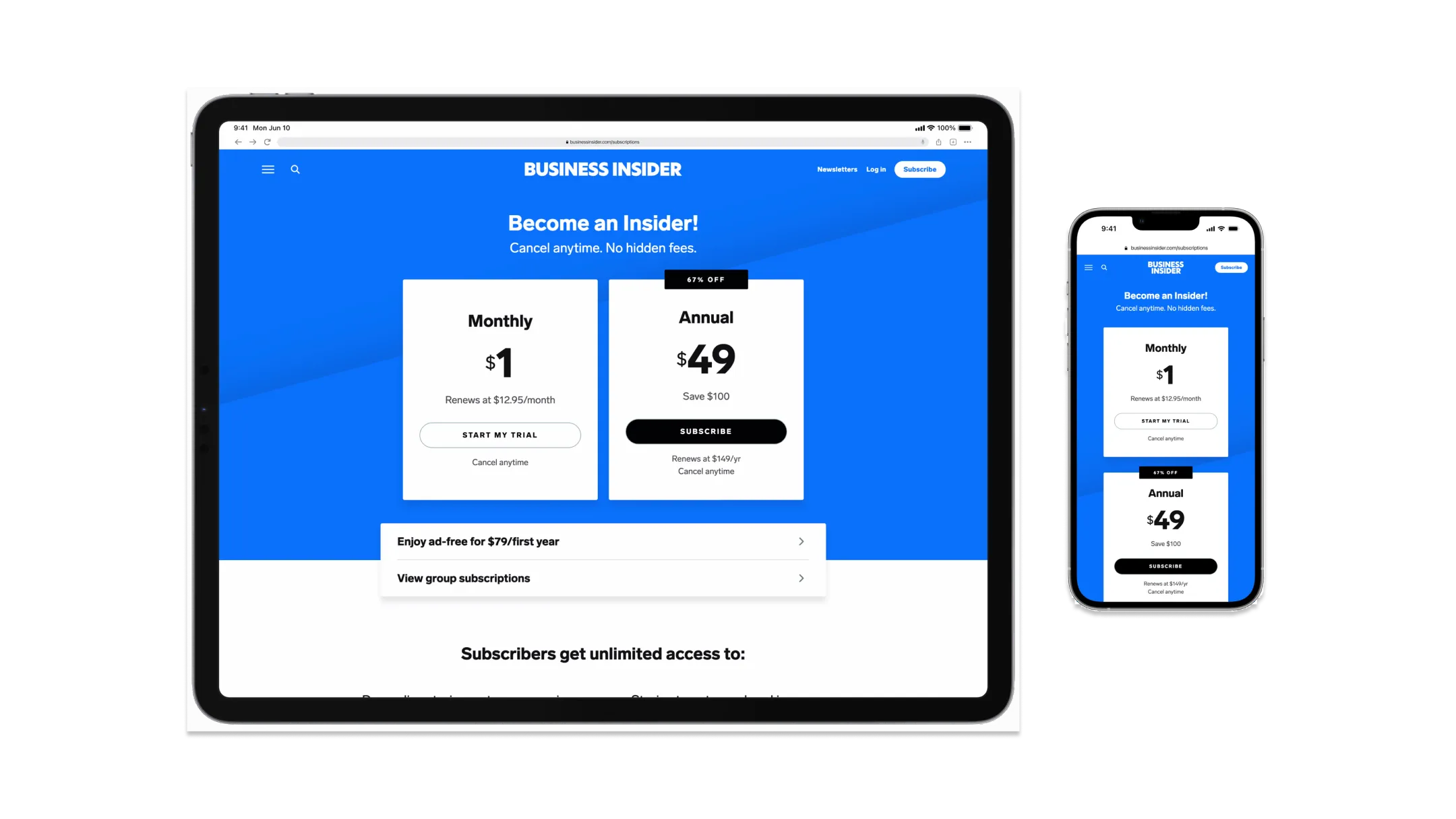
Business Insider aimed to improve mobile checkout conversions by simplifying the process—allowing users to subscribe before creating an account. This shift reduced friction and increased conversions, resulting in a 6% rise in mobile subscriptions.
Business Insider aimed to improve mobile checkout conversions by simplifying the process—allowing users to subscribe before creating an account. This shift reduced friction and increased conversions, resulting in a 6% rise in mobile subscriptions.
Business Insider aimed to improve mobile checkout conversions by simplifying the process—allowing users to subscribe before creating an account. This shift reduced friction and increased conversions, resulting in a 6% rise in mobile subscriptions.
Business Insider aimed to improve mobile checkout conversions by simplifying the process—allowing users to subscribe before creating an account. This shift reduced friction and increased conversions, resulting in a 6% rise in mobile subscriptions.
Rethinking the Checkout Experience
Rethinking the Checkout Experience
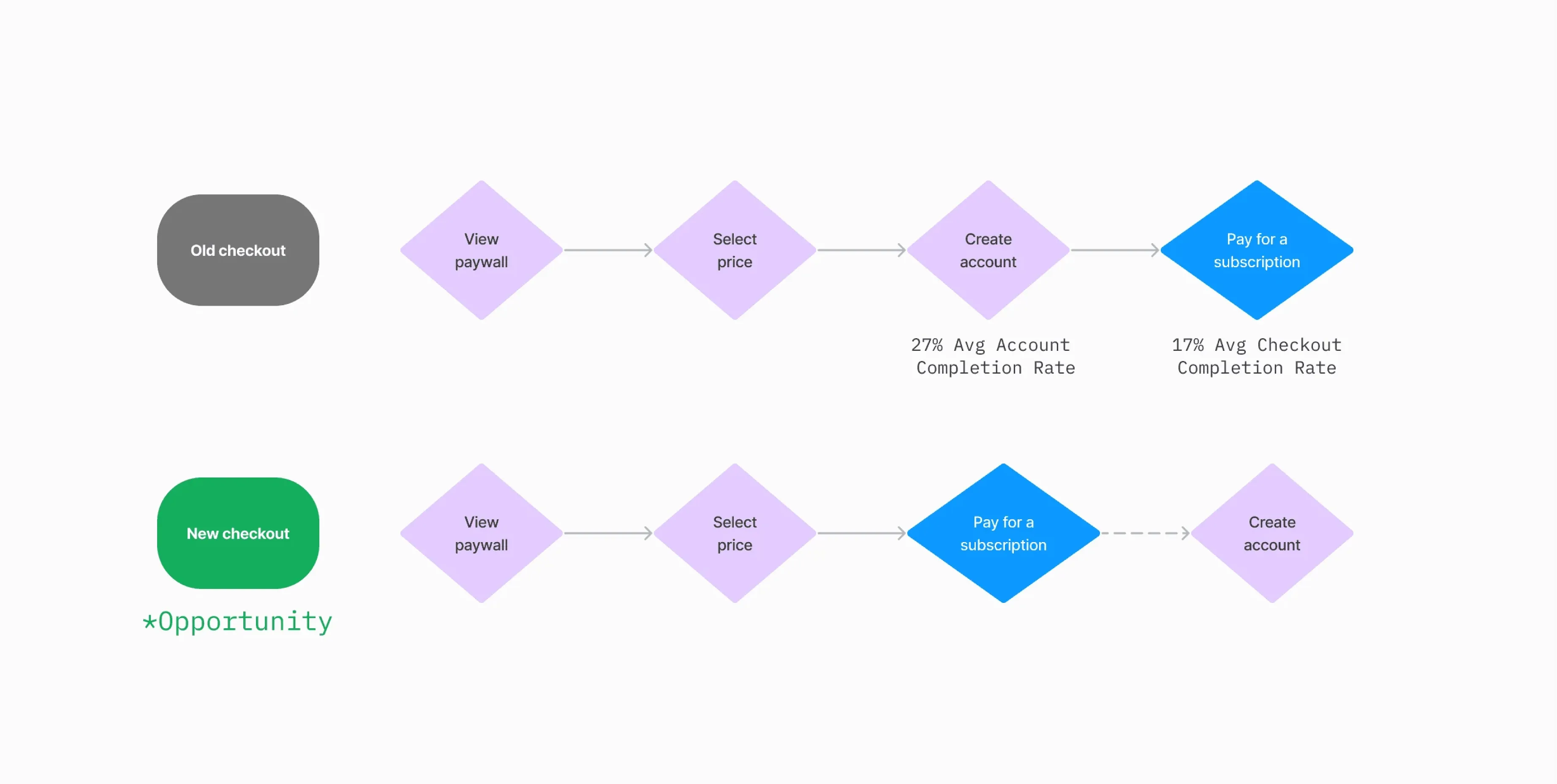
Business Insider set out to improve its mobile checkout completion rates after noticing a significant drop-off once users were prompted to create an account. I identified friction in the existing process and proposed a new approach: allowing users to complete their subscription checkout first and then create an account later. This shift aimed to streamline the experience and increase conversions.
Business Insider set out to improve its mobile checkout completion rates after noticing a significant drop-off once users were prompted to create an account. I identified friction in the existing process and proposed a new approach: allowing users to complete their subscription checkout first and then create an account later. This shift aimed to streamline the experience and increase conversions.
Identifying the Problem
Identifying the Problem
The old subscription process included too many steps, making it cumbersome for users, especially those on mobile. While mobile traffic had surged through platforms like Google Discover, mobile users were converting at much lower rates than desktop users. Data revealed that only about 7% of mobile users who entered the checkout flow actually completed their purchases.
The old subscription process included too many steps, making it cumbersome for users, especially those on mobile. While mobile traffic had surged through platforms like Google Discover, mobile users were converting at much lower rates than desktop users. Data revealed that only about 7% of mobile users who entered the checkout flow actually completed their purchases.
Compounding the problem was the company’s reliance on a third-party vendor, which imposed constraints on redesigning the experience and optimizing the flow as needed. Bringing the checkout experience in-house would allow the team to simplify the process, increase conversion rates, and eliminate vendor dependency, giving them full control over the UX.
Compounding the problem was the company’s reliance on a third-party vendor, which imposed constraints on redesigning the experience and optimizing the flow as needed. Bringing the checkout experience in-house would allow the team to simplify the process, increase conversion rates, and eliminate vendor dependency, giving them full control over the UX.
A Frictionless Approach
A Frictionless Approach
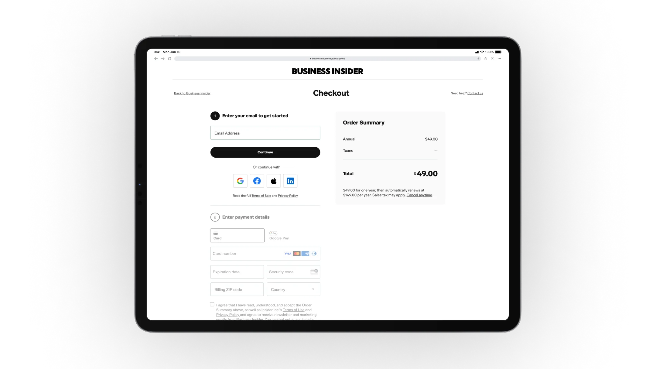
To create a seamless checkout experience, I focused on improving the overall design, making it more intuitive and frictionless while staying on-brand. Reducing drop-offs was a priority, along with tracking user behavior to better understand pain points and refine the experience. I conducted usability testing through usertesting.com, interviewing six participants and asking them to complete a subscription purchase using Figma prototypes.
To create a seamless checkout experience, I focused on improving the overall design, making it more intuitive and frictionless while staying on-brand. Reducing drop-offs was a priority, along with tracking user behavior to better understand pain points and refine the experience. I conducted usability testing through usertesting.com, interviewing six participants and asking them to complete a subscription purchase using Figma prototypes.
The winner designation was implemented to highlight the editor's top choice with a clear call-to-action. Mobile-friendly comparison tables were designed to ensure seamless viewing without horizontal scrolling, making the content more accessible and intuitive.
One participant noted, “I liked how I did not have to relearn how to complete a checkout process; it is similar to what most brands have out there. The fact that I did not have to create an account beforehand was actually really convenient.”
Understanding User Behavior
Understanding User Behavior
While some users appreciated the post-checkout account creation, others preferred setting up an account beforehand. By analyzing consumer behavior, the team found that many conversions stemmed from a $1 trial, largely driven by readers trying to unlock breaking news. This insight confirmed the value of delayed account creation, allowing the company to capture subscriptions as quickly as possible.
While some users appreciated the post-checkout account creation, others preferred setting up an account beforehand. By analyzing consumer behavior, the team found that many conversions stemmed from a $1 trial, largely driven by readers trying to unlock breaking news. This insight confirmed the value of delayed account creation, allowing the company to capture subscriptions as quickly as possible.
Engineering a Better Solution
Engineering a Better Solution
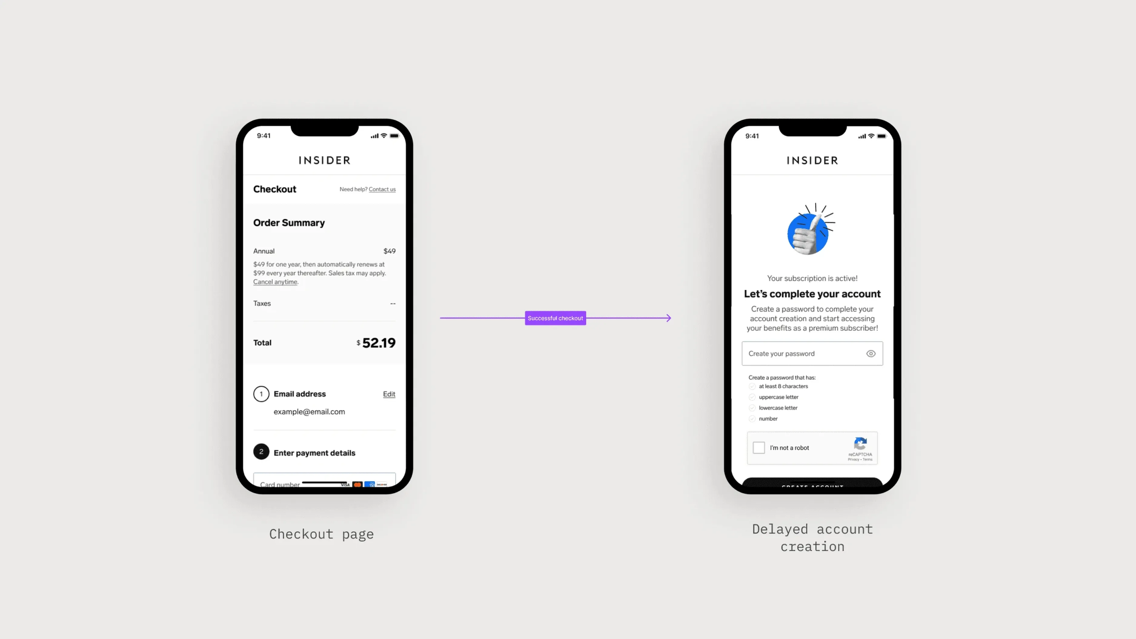
To ensure a smooth rollout, the team built the new checkout flow using existing corporate subscription components. This approach maintained consistency while reducing engineering complexity. Collaborating closely with product managers and engineers, they developed a system that prioritized a frictionless experience. Users could subscribe using only an email address, postponing password creation until after checkout. This adjustment enabled them to immediately access premium content while being prompted later to complete their account setup.
To ensure a smooth rollout, the team built the new checkout flow using existing corporate subscription components. This approach maintained consistency while reducing engineering complexity. Collaborating closely with product managers and engineers, they developed a system that prioritized a frictionless experience. Users could subscribe using only an email address, postponing password creation until after checkout. This adjustment enabled them to immediately access premium content while being prompted later to complete their account setup.
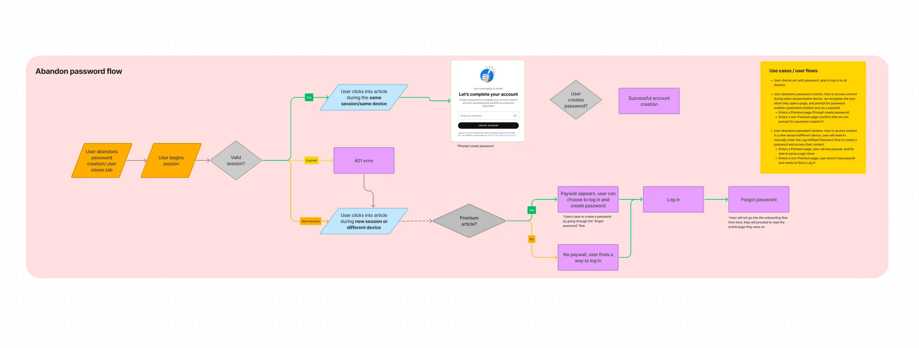
Designing for Edge Cases
Designing for Edge Cases
A major challenge arose in cases where users skipped password creation after checkout, potentially preventing them from accessing premium articles. To address this, engineers implemented a cookie-based solution that identified users who abandoned the process and prompted them to complete account creation when they returned to the site. This ensured a seamless transition while keeping friction minimal.
A major challenge arose in cases where users skipped password creation after checkout, potentially preventing them from accessing premium articles. To address this, engineers implemented a cookie-based solution that identified users who abandoned the process and prompted them to complete account creation when they returned to the site. This ensured a seamless transition while keeping friction minimal.
A Phased Rollout
A Phased Rollout
The rollout was structured in two phases. The first phase, launched at the end of Q3 2022, introduced the new checkout experience, focusing on reducing friction and increasing conversions. The second phase centered on subscription management features, allowing users to upgrade, cancel, pause, or update payments directly on the site.
The rollout was structured in two phases. The first phase, launched at the end of Q3 2022, introduced the new checkout experience, focusing on reducing friction and increasing conversions. The second phase centered on subscription management features, allowing users to upgrade, cancel, pause, or update payments directly on the site.
Results
Results
The results spoke for themselves. With more users successfully completing the checkout flow, Business Insider saw a 6% increase in overall completion rates—translating to roughly 2,500 additional subscriptions per month.
The results spoke for themselves. With more users successfully completing the checkout flow, Business Insider saw a 6% increase in overall completion rates—translating to roughly 2,500 additional subscriptions per month.
Project Details
MY CONTRIBUTION
UX Design
Visual Design
Usability Design
TEAM
Solo Designer
3 Product Managers
7+ Engineers
PROJECT TIMELINE
March 2022 - May 2022
Related Cases studies

Spotify
Crypto App

F. Schumacher
Business Insider
I’m currently available for work
Let's talk about your project

I’m currently available for work
Let's talk about your project
Project Details
My Contribution
UX Design
Visual Design
Usability Design
Team
Solo Designer
3 Product Managers
7+ Engineers
Project Timeline
March 2022 - May 2022
RELATED CASE STUDIES

I’m currently available for work
Let's talk about your project
I’m currently available for work
Let's talk about your project
Project Details
My Contribution
UX Design
Visual Design
Usability Testing
Team
Solo Designer
3 Product Managers
7+ Engineers
Project Timeline
March 2022 - May 2022
RELATED CASE STUDIES
Project Details
My Contribution
UX Design
Visual Design
Usability Testing
Team
Solo Designer
3 Product Manager
7+ Engineers
Project Timeline
March 2022 - May 2022
RELATED CASE STUDIES
I’m currently available for work
Let's talk about your project
I’m currently available for work
Let's talk about your project
I’m currently available for work